Fonts
SHB Grotesk – Taf Studio
taf-studio.comStudio Feixen Fonts
fonts.studiofeixen.chStudio Feixen Fonts is a type foundry founded by the Swiss design studio Studio Feixen.Everyone. Everywhere. Everything.
monotype.comHelvetica® Now is a new chapter in the story of perhaps the best-known typeface of all time. Available in three optical sizes—Micro, Text, and Display—ever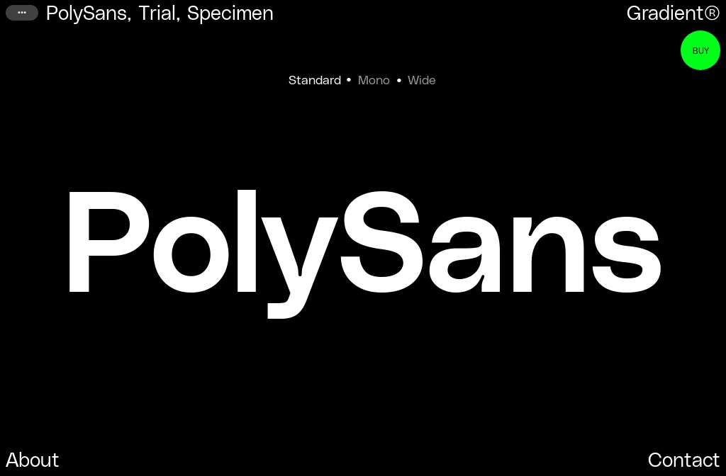
PolySans Standard
wearegradient.net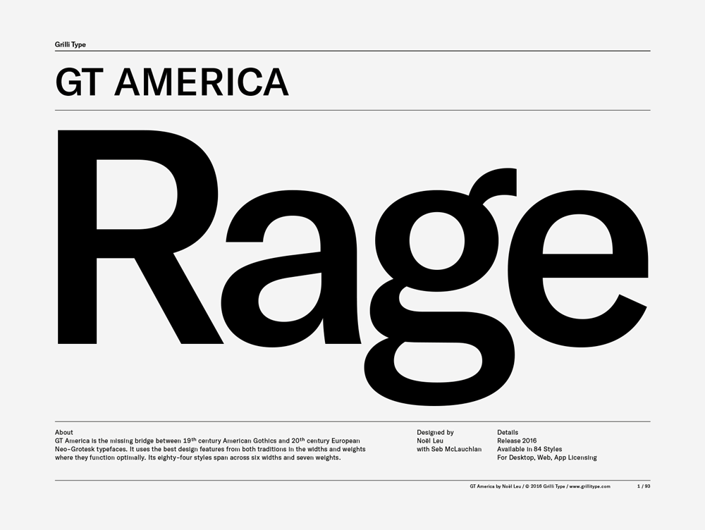
GT America – Typeface Specimen and License Purchase
grillitype.comGT America is the missing bridge between 19th century American Gothics and 20th century European Neo-Grotesk typefaces. It uses the best design features from both traditions in the widths and weights where they function optimally.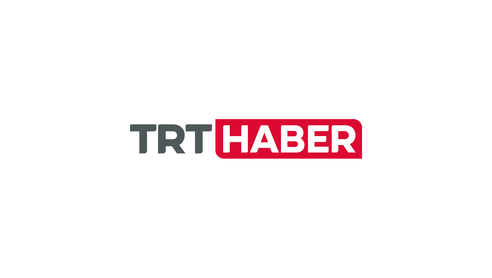
TRT Custom Type | Didem Öğmen
didemogmen.comDidem is an independent type designer based in Istanbul, Turkey. She creates custom and retail typefaces, lettering and logo designs for local and international clients.
Open Foundry / Fonts
open-foundry.comA new platform for open-source fonts in a noise-free environment, to highlight their beauty, extend functionality and encourage further exploration.
Free Fonts on Type Fan – The Best Web Fonts
type.fan✦ Find perfect typefaces for your next project. We tell you where to get the best free fonts as well as commercial fonts for web design.
Sneak on TIGHTYPE
tightype.comSneak is a neo-grotesque typeface, featuring several reversed characters, such as its distinctive S.
Diatype
abcdinamo.comDiatype is a warm yet sharp grotesque with reader friendly shapes that harken back to the typesetting era. It’s available in five weights and italics, and also in monospaced and semi-monospaced styles.
Agile Sans Font - YouWorkForThem
youworkforthem.comAgile Sans is a contemporary humanist font family with classicist roots. Hence its name, Agile Sans suits many occasions from branding to publications, we...
Inria Identity Font - Case Studies - Black Foundry
black-foundry.comInria Sans and Inria Serif are the two members of a type family designed for the communication of Inria.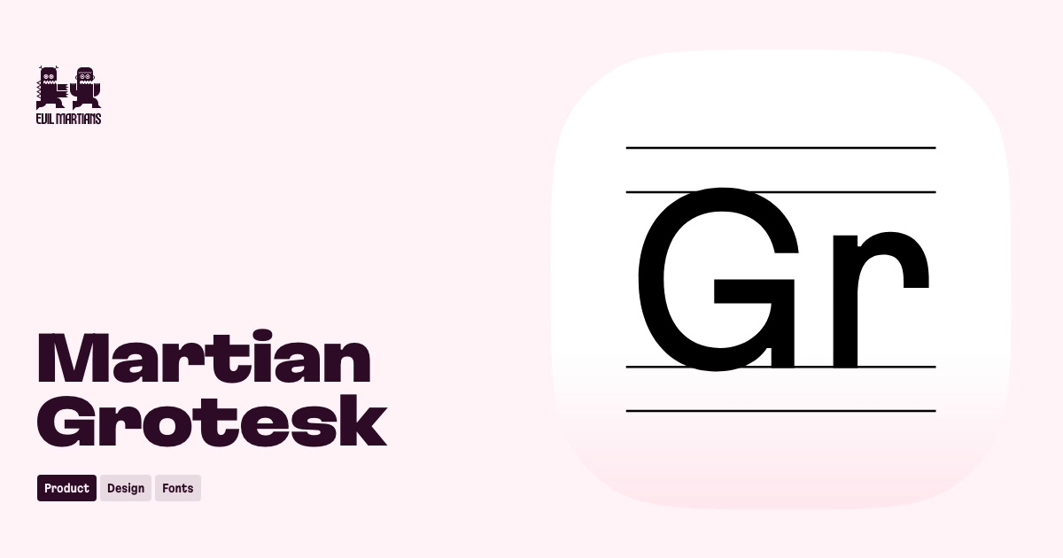
Martian Grotesk at Evil Martians
evilmartians.comA typeface family with a strong personality designed for web and digital projects. It contains a variable font and 63 styles. Martian Grotesk appears legible on most platforms, even when being rendered in small sizes.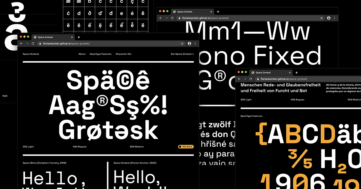
Space Grotesk
floriankarsten.github.ioSpace Grotesk is a proportional sans-serif typeface variant based on Colophon Foundry's fixed-width Space Mono family (2016). Designed by Florian Karsten.
Manrope Font
gent.mediaManrope – free sans-serif variable font
IBM Plex
ibm.comIBM Plex® is our new typeface. It’s global, it’s versatile, and it’s distinctly IBM.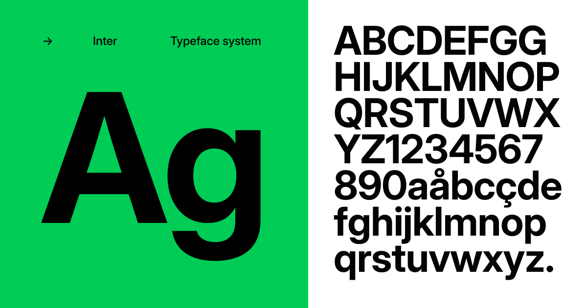
Inter font family
rsms.meInter is a typeface family optimized for user interfaces and computer screens
Free Faces
freefaces.galleryThis website is a curated collection of typefaces that are available under a variety of free licences somewhere on the interwebs.
Univers Next® font family | Linotype.com
linotype.comLinotype Univers is a completely reworked version of the original Univers Univers typeface family designed by Adrian Frutiger in 1957. After a long process of painstakingly detailed revision, Frutiger and the design staff at Linotype completed this large joint project in 1997. The result: a brilliant and cohesive font family of 63 weights and styles including the 4 monospaced typewriter weights. All the existing weights were completely redrawn, with careful attention paid to making the proportions more consistent with each other and improving fine details such as curves and thick-to-thin stroke ratios. The family was expanded from 27 to 63 weights, providing a much larger framework to graphic designers for choosing just the right style. The bold and condensed weights were reworked for improved legibility and on-screen application. The stroke weights were revised for consistency within each face as well as in relationship to the other weights. By following Frutiger's original designs, the humanist character of the sans serif Univers now comes through more distinctly. The systemized numbering system has also been updated. With its sturdy, clean forms Univers can facilitate an expression of cool elegance and rational competence. In fact, the strong familial relationships between all the styles and weights make it a serviceable choice for large graphic design projects that require versatility with consistency. Frutiger was successful in staying true to his initial aims; the new Linotype Univers does indeed work in longer texts as well as for display settings. In 2010 the typeface family was extended and renamed into a more logical naming of
Berkeley Mono Typeface
berkeleygraphics.comA love letter to the golden era of computing.Introducing Operator | Fonts by Hoefler&Co.
typography.comA monospace typeface, a monospace-inspired typeface, and a short film about type design.
Aperçu Font — Colophon Foundry
colophon-foundry.orgColophon is an international, award-winning type foundry based in London (UK) and Los Angeles (US). We create, publish, and distribute high-quality retail and custom typefaces for analog and digital media.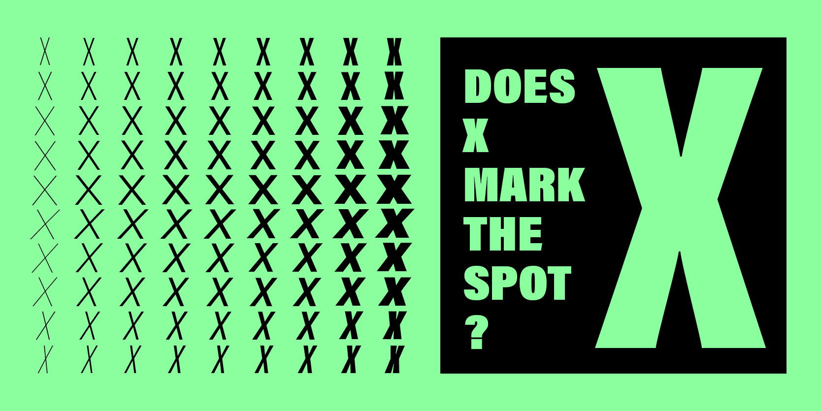
Acumin from Adobe Originals
fonts.adobe.comA sans serif typeface with 90 styles, available from Adobe Fonts for sync and web use. Adobe Fonts is the easiest way to bring great type into your workflow, wherever you are.DM Sans - Google Fonts
fonts.google.comDM Sans is a low-contrast geometric sans serif design, intended for use at smaller text sizes. DM Sans supports a Latin Extended glyph set, enabling typesettingPlus Jakarta Sans - Google Fonts
fonts.google.comPlus Jakarta Sans is a fresh take on geometric sans serif styles, designed by Gumpita Rahayu from Tokotype. The fonts were originally commissioned by 6616 StudiGenerate font pairing using neural nets
fontjoy.comFontjoy helps designers choose the best font combinations. Mix and match different fonts for the perfect pairing.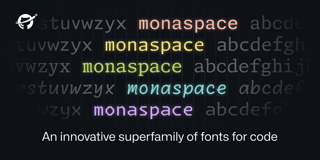
Monaspace
monaspace.githubnext.comAn innovative superfamily of fonts for code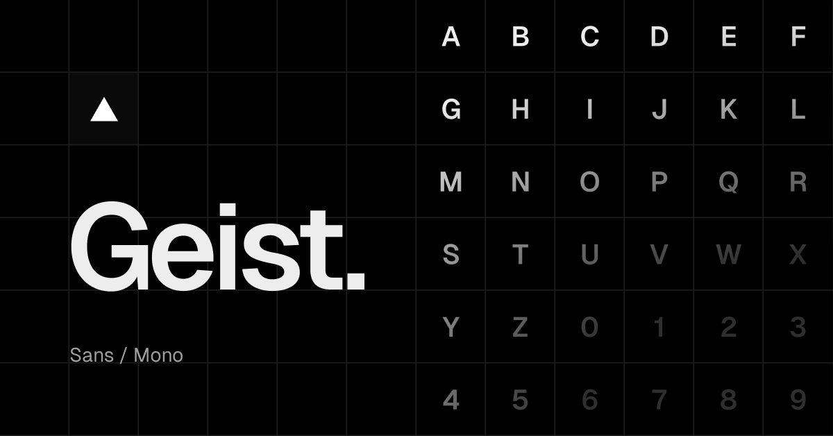
Geist Font — Vercel
vercel.comGeist is a typeface made for developers and designers, embodying Vercel's design principles of simplicity, minimalism, and speed, drawing inspiration from the renowned Swiss design movement.
Lausanne – WK®
weltkern.com
Graphik
type.todayGraphik was inspired by the appealing plainness seen in many of the less common 20th century European sans serifs and in the hand-lettering of classic Swiss Modern posters. The lighter weights were influenced by the less popular sans serifs that many European foundries released to compete with Futura, Helvetica and Univers, the juggernauts of 20th century sans serifs. These influences included Neuzeit Grotesk, Folio, Recta, and Maxima. The heavy end of the family is inspired in part by Paul Renner’s Plak, a relatively obscure display typeface cut only in large sizes.Braun font
iconwerk.com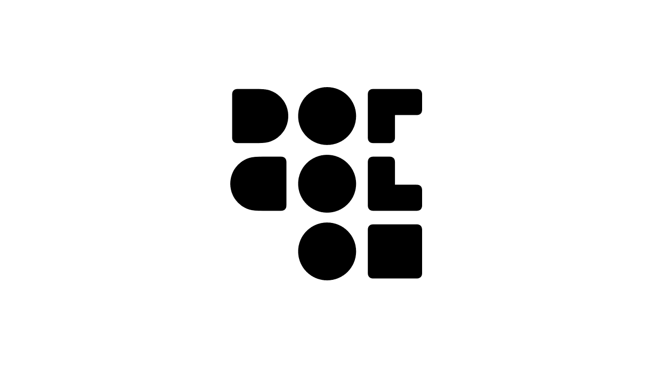
ドットコロン
dotcolon.netデザイナー佐賀野宇宙が作ったオリジナルフォントを公開しています。商用・非商用を問わず、自由にご利用いただけます。fontain = a font-collection (and a font-collection-system)
fontain.orgfontain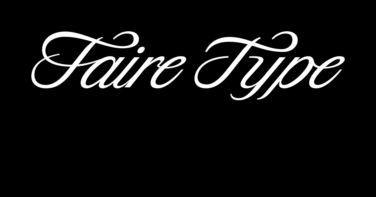
Faire Type
fairetype.comWe are a Brooklyn-based type foundry creating dynamic retail fonts that fit the moment and bespoke custom fonts and logotypes for brands.
Fontstore: Fonts for Every Language
fontstore.comFontstore is a premium font distribution service from the Indian Type Foundry (ITF), offering quality fonts for all the world’s languages.
SORA. Many Worlds. One Economy.
sora.orgSORA is working to become the new economic system for the Earth, the metaverse, and beyond. SORA has a Kusama Parachain network to enable seemless interaction with Kusama and Polkadot.Jost*
indestructibletype.com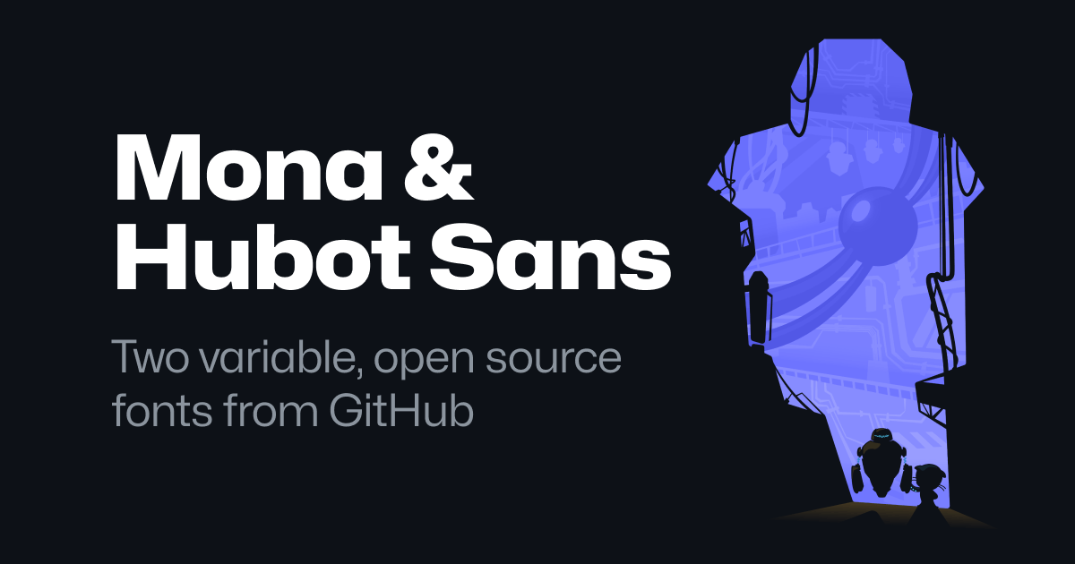
Mona Sans & Hubot Sans
github.comTwo variable, open source fonts from GitHub.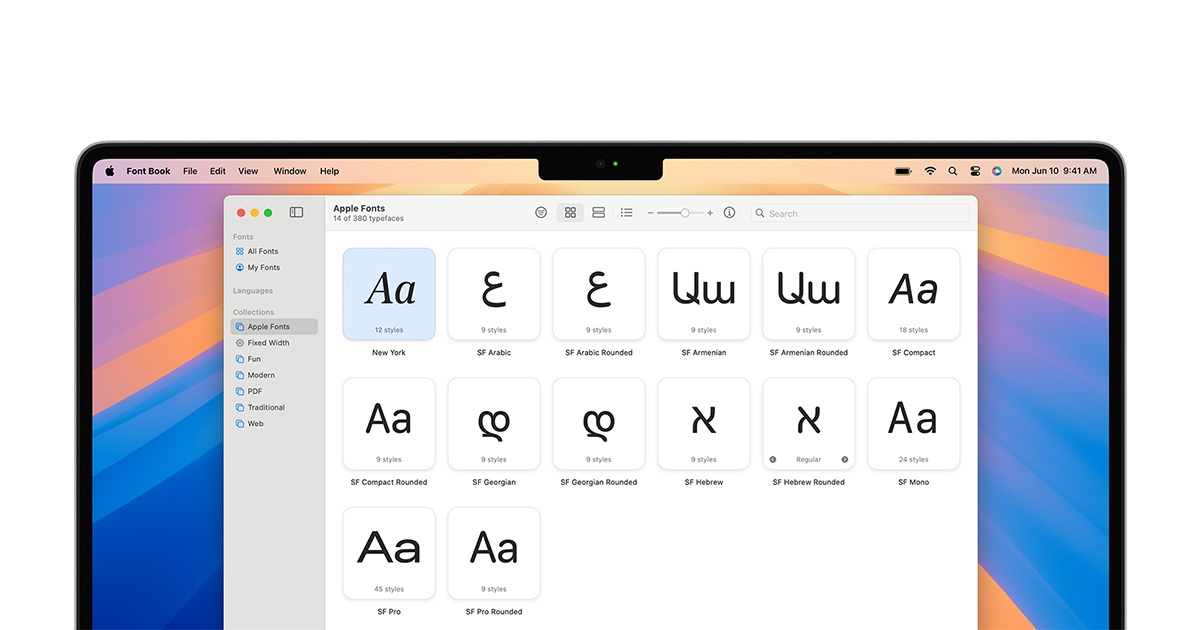
Fonts - Apple Developer
developer.apple.comGet the details, frameworks, and tools you need to use system fonts for Apple platforms in your apps.Overpass Font
overpassfont.orgHack | A typeface designed for source code
sourcefoundry.orgProgramming Fonts - Test Drive
programmingfonts.orgTry out the best and newest monospace fonts for codeTASA Typeface Collection | Local Remote
tasatype.localremote.co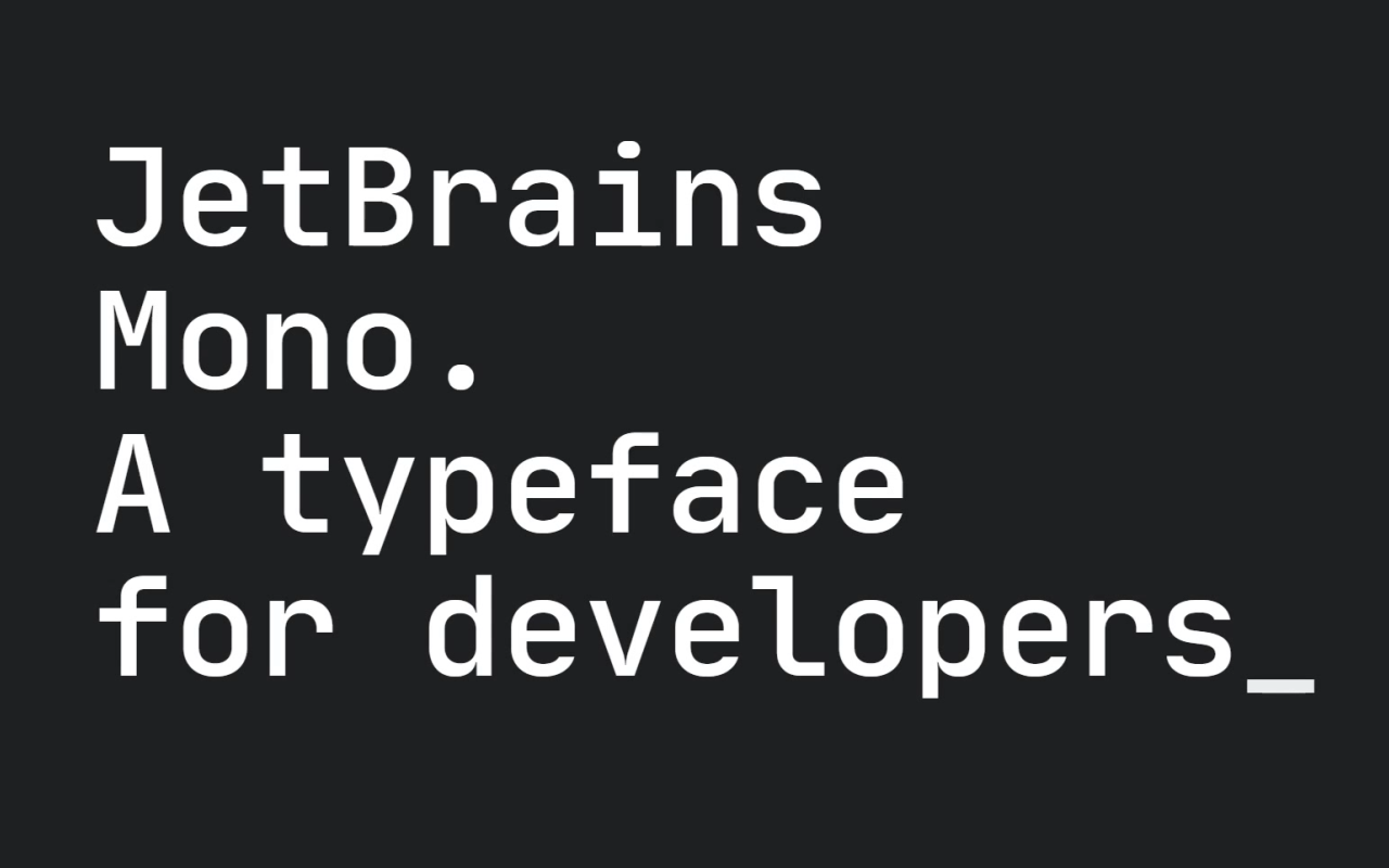
JetBrains Mono: A free and open source typeface for developers
jetbrains.comTry JetBrains Mono in your IDE. Its simple forms and attention to every detail make coding a nice experience for developers’ eyes, no matter which IDE you choose.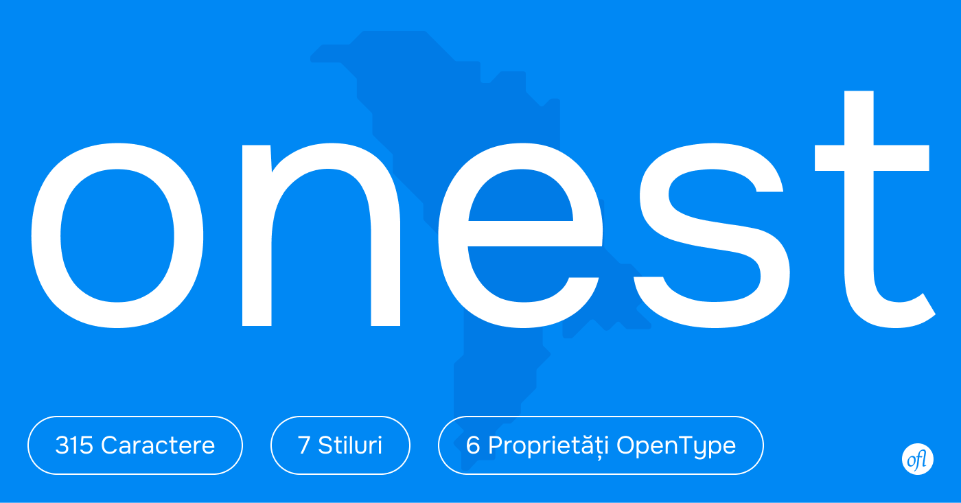
Onest font
onest.mdThe first typeface designed for Moldova to make communication more open and honest.
Home — Colophon Foundry
colophon-foundry.orgColophon is an international, award-winning type foundry based in London (UK) and Los Angeles (US). We create, publish, and distribute high-quality retail and custom typefaces for analog and digital media.
Monument Grotesk
abcdinamo.comDINAMO is a Swiss type design agency offering retail and bespoke typefaces, design software, research, and consultancy. Founded in Basel, we operate via a network of satellite members across the globe.